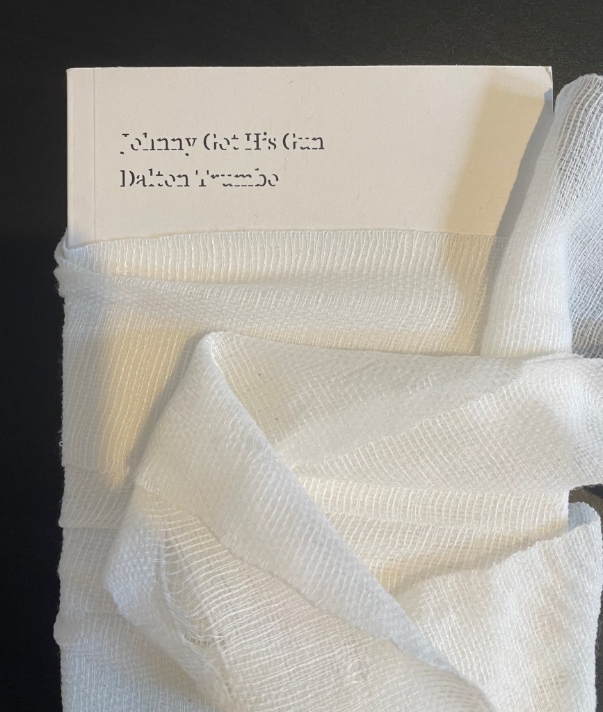
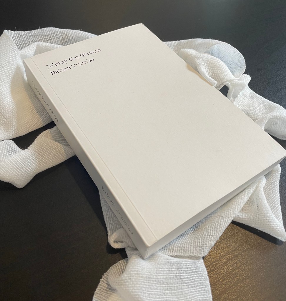
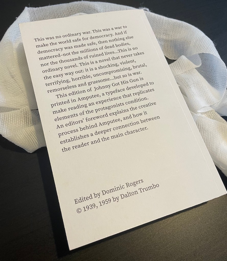
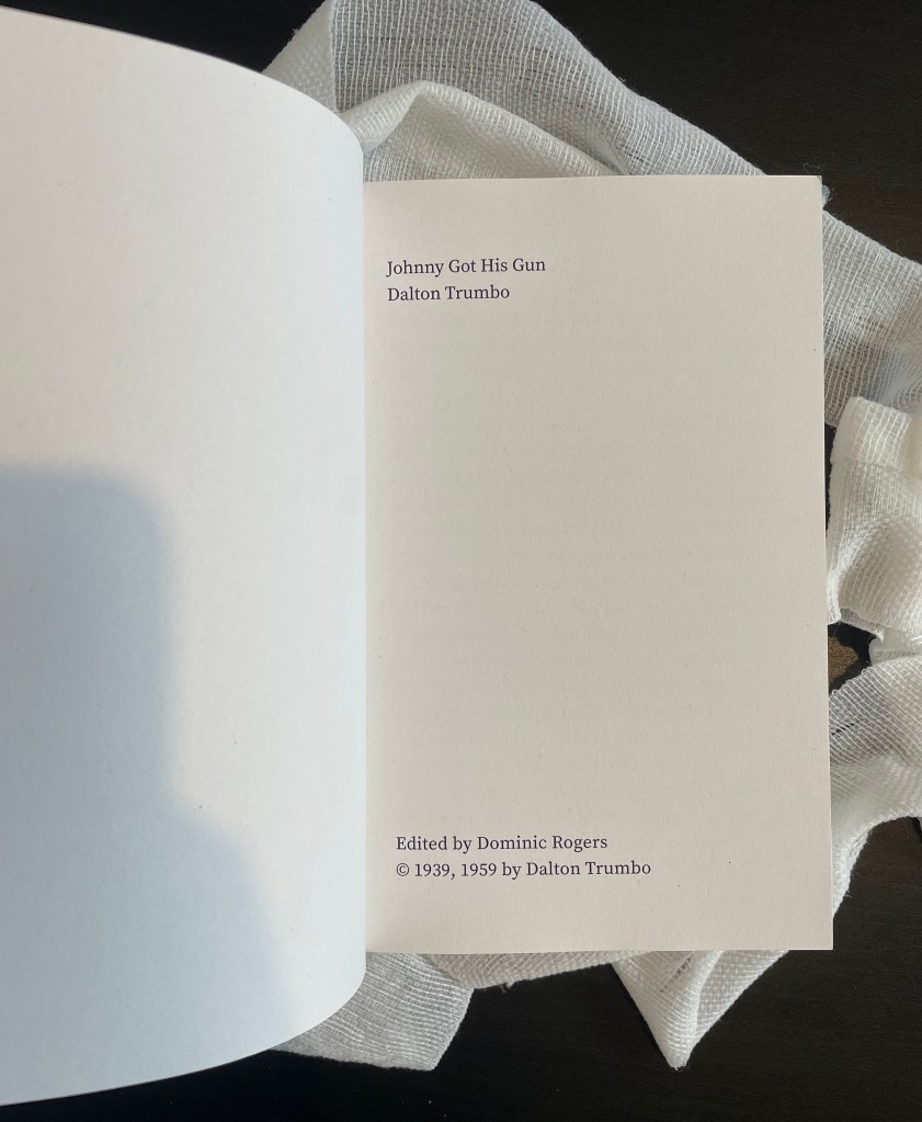
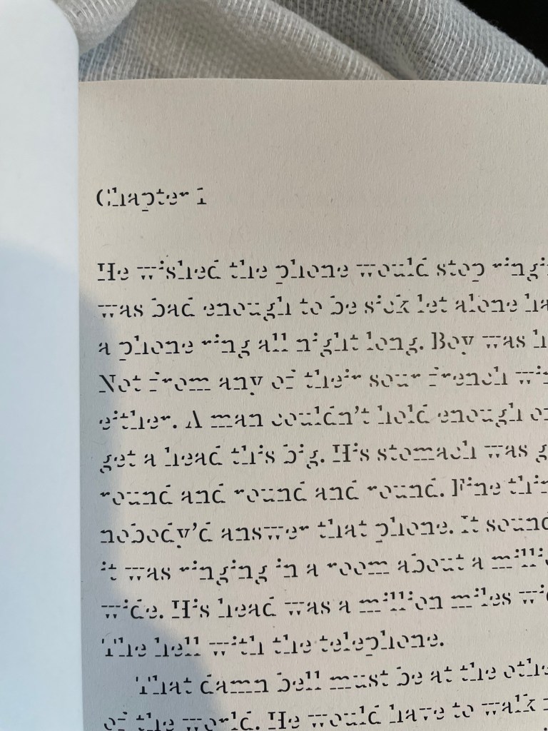
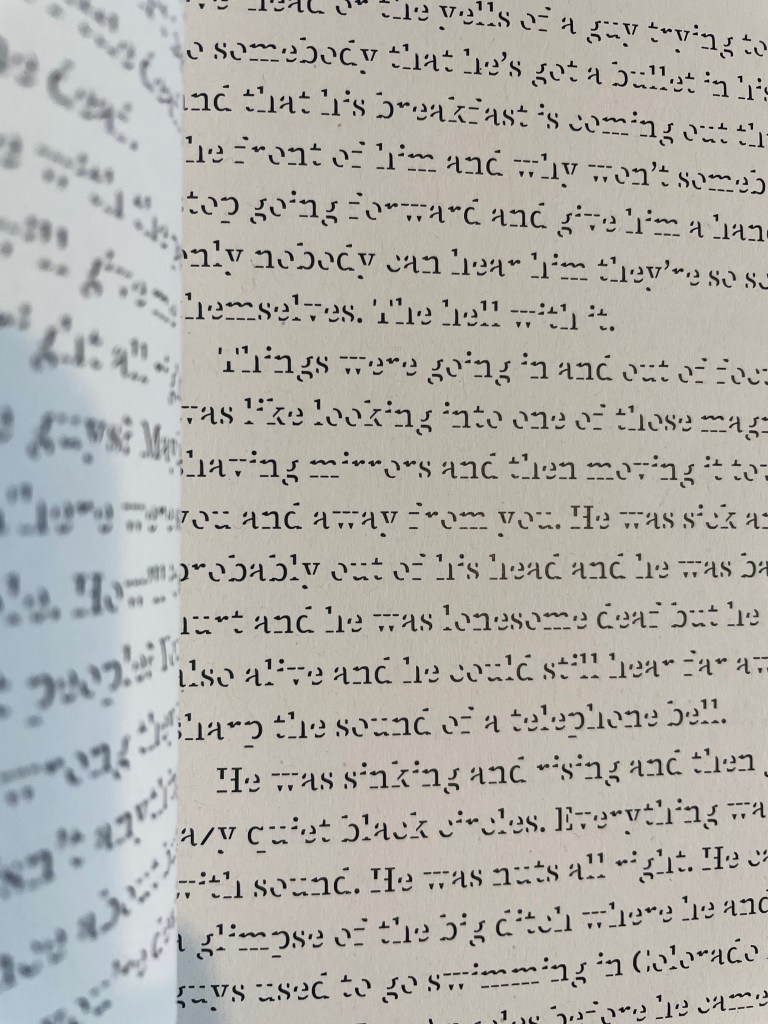
Lost is one of my most conceptual and sensitive projects, despite being black and white, it carries the most meaning and depth of every creative decision made. It’s a redesigned version of Dalton Trumbo’s ‘Johnny Got His Gun’ published in 1939. It’s a story spoken from the viewpoint of an incapacitated man, broken as a result of fighting for his country.
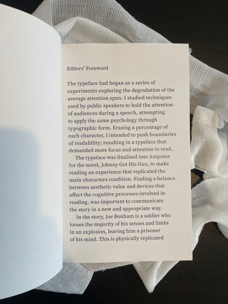
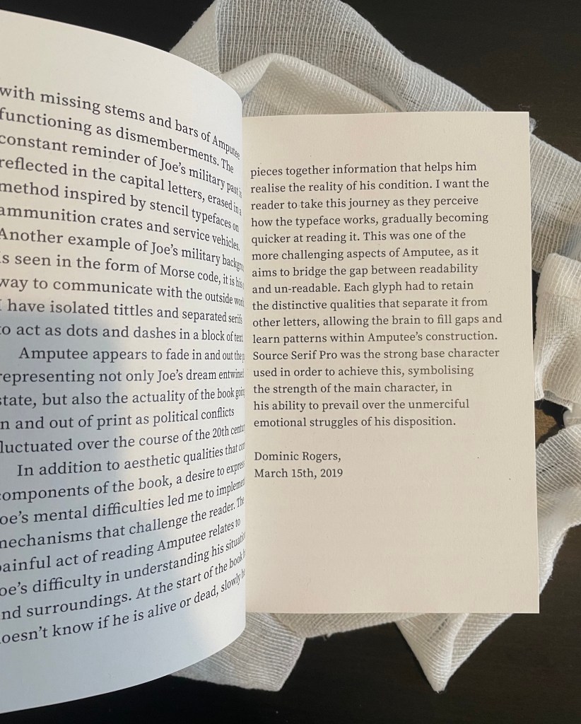
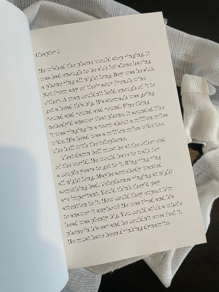
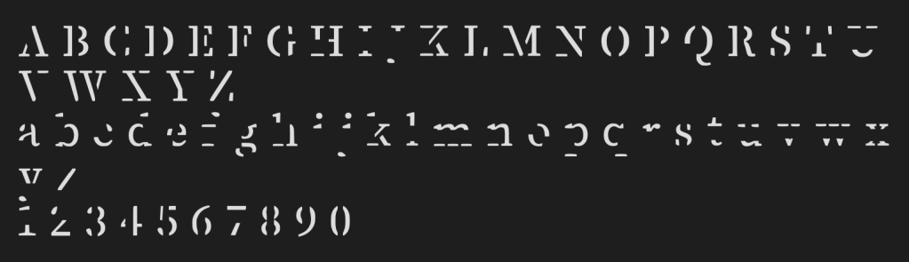
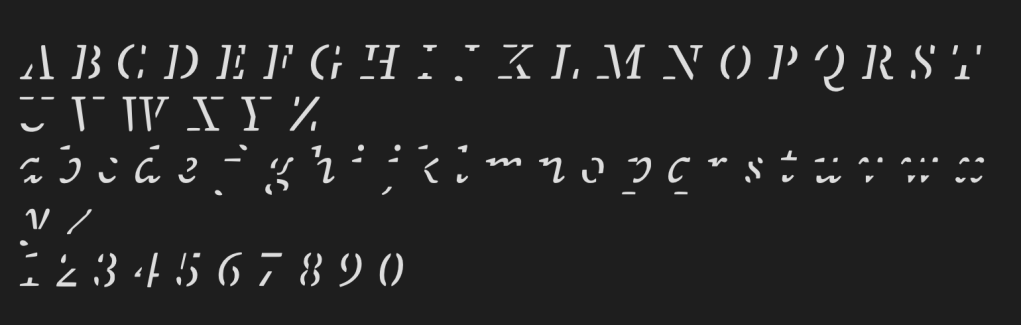
I created the typeface Amputee to portray with elements of the story, bringing the reader closer to Johnny’s physical and mental condition. The missing limbs of letters are an abstraction of his own missing limbs, the painful act of reading relates to his struggle to understand his current situation. Gradually as the reader learns to read the typeface they get quicker, mimicking Johnny as he figures out his surroundings and physical state. Mentally Johnny goes through many stages in the book, he concurs these out of strength. Figuratively the typeface replicates these stages with a strong base character of Source Serif Pro allowing legibility despite parts of the glyph being erased. Through the book Johnny’s militarily past haunts him, this is seen in the capital characters of Amputee. They are purposefully erased in a similar form to stencil typefaces he saw on ammo crates and tanks. Overall the typeface was cut to leave as many dots and dashes as possible, this in tern makes it look like morse code; a pivotal form of communication for the military and later in the story.
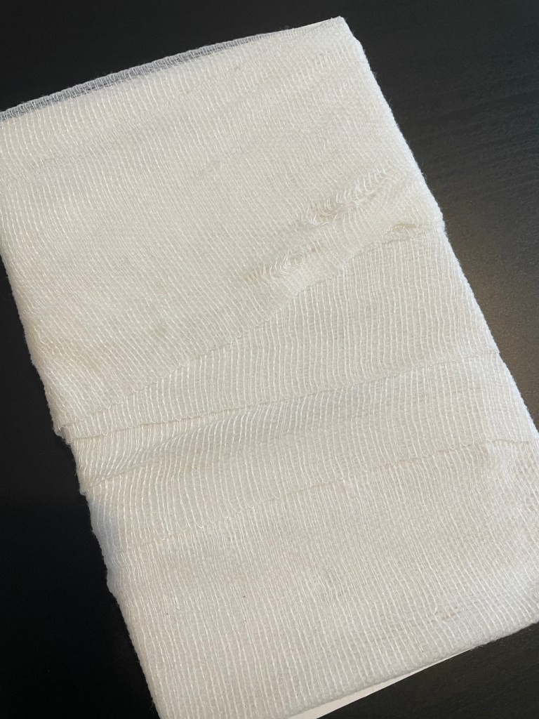
The black and white choice is because Johnny is now blind and very much in a world without colour. Page numbers don’t exist because dates or the passing of time don’t to Johnny and the book is wrapped in a bandage as he is after the explosion that took place.